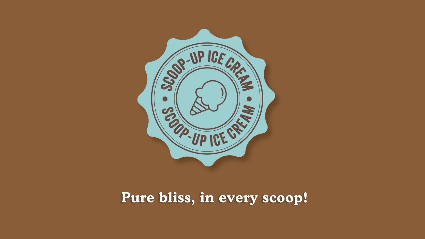
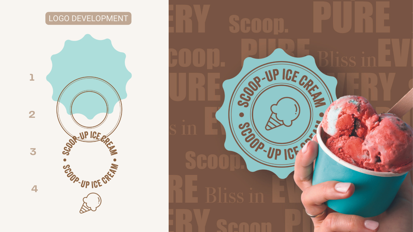
LOGO & BRANDING
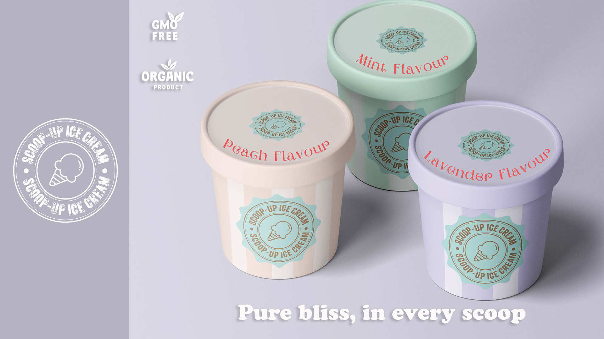
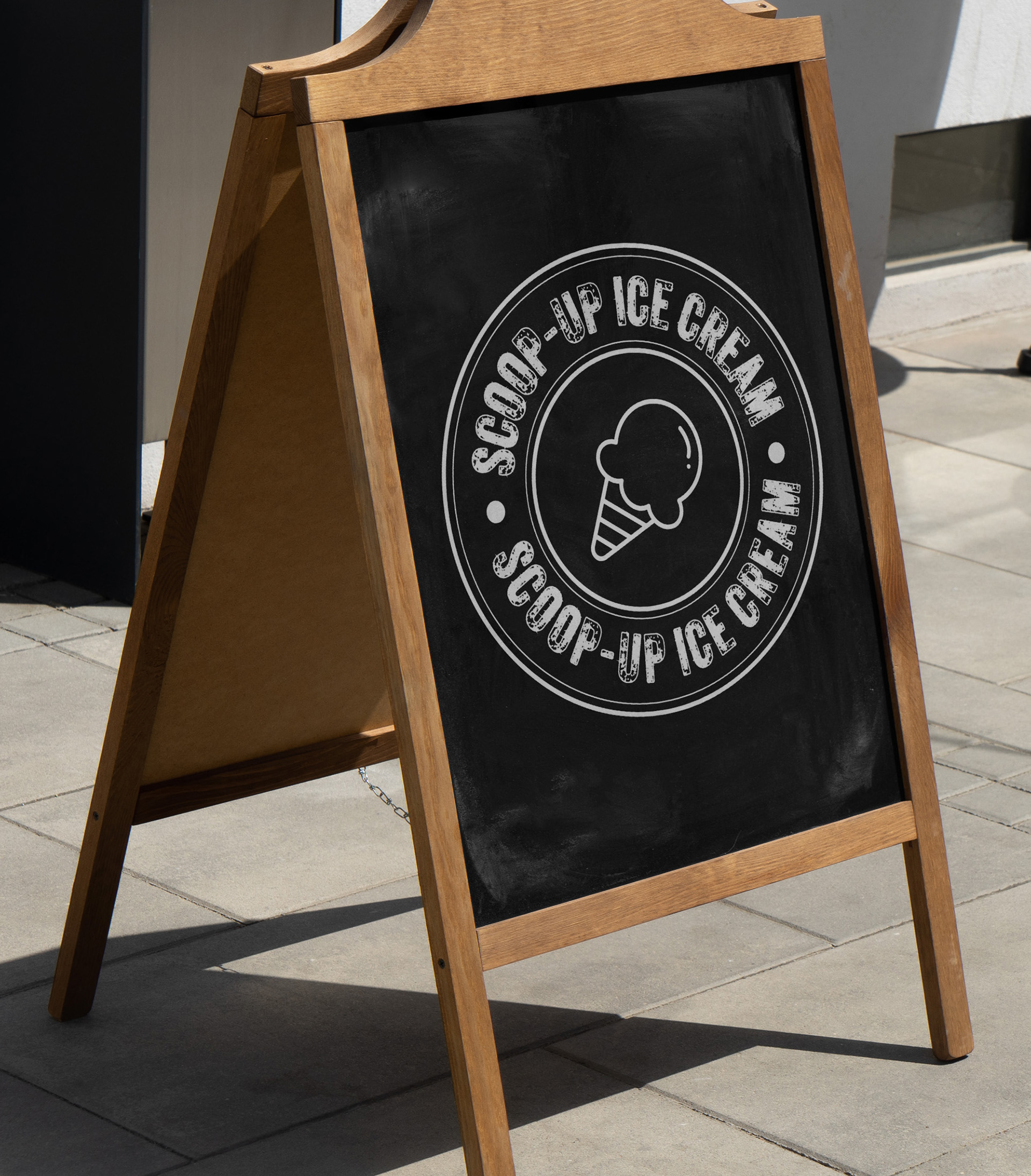
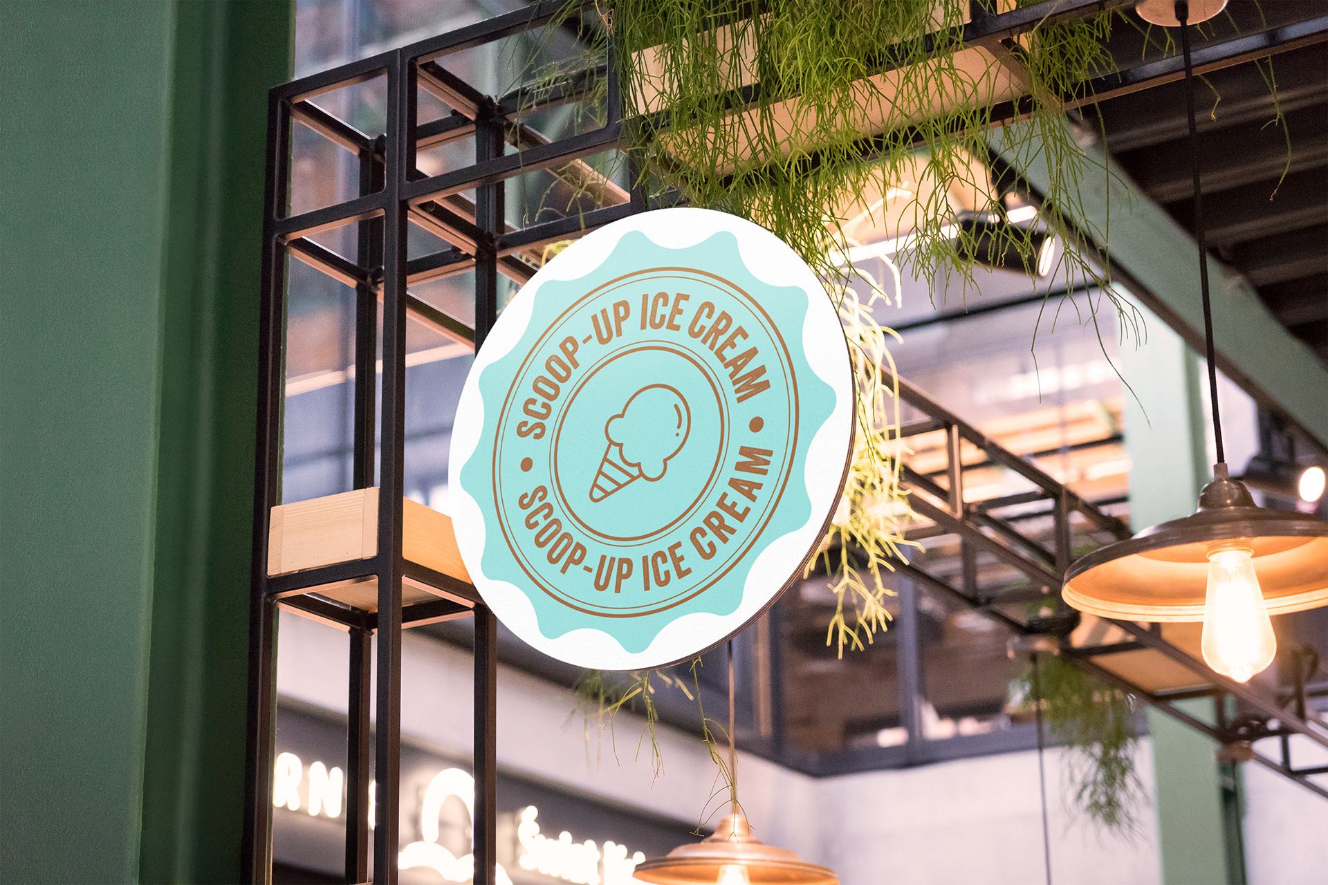
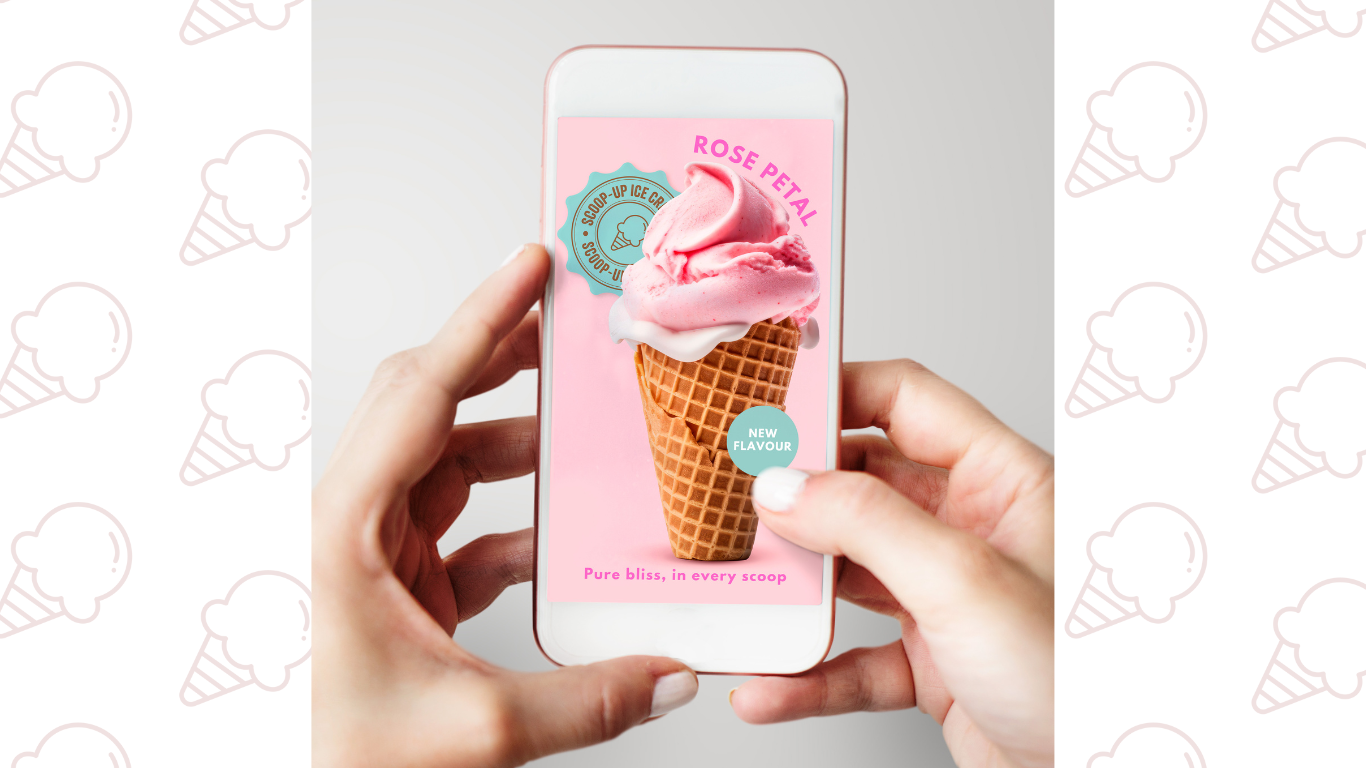
My goal with Scoop-Up Ice Cream's branding was to show that every scoop is pure bliss, made with love and real ingredients. I wanted people to feel like they're getting a special treat when they visit. The badge-style design imparts a sense of tradition and authenticity while fostering a strong connection with the Scoop-Up brand.
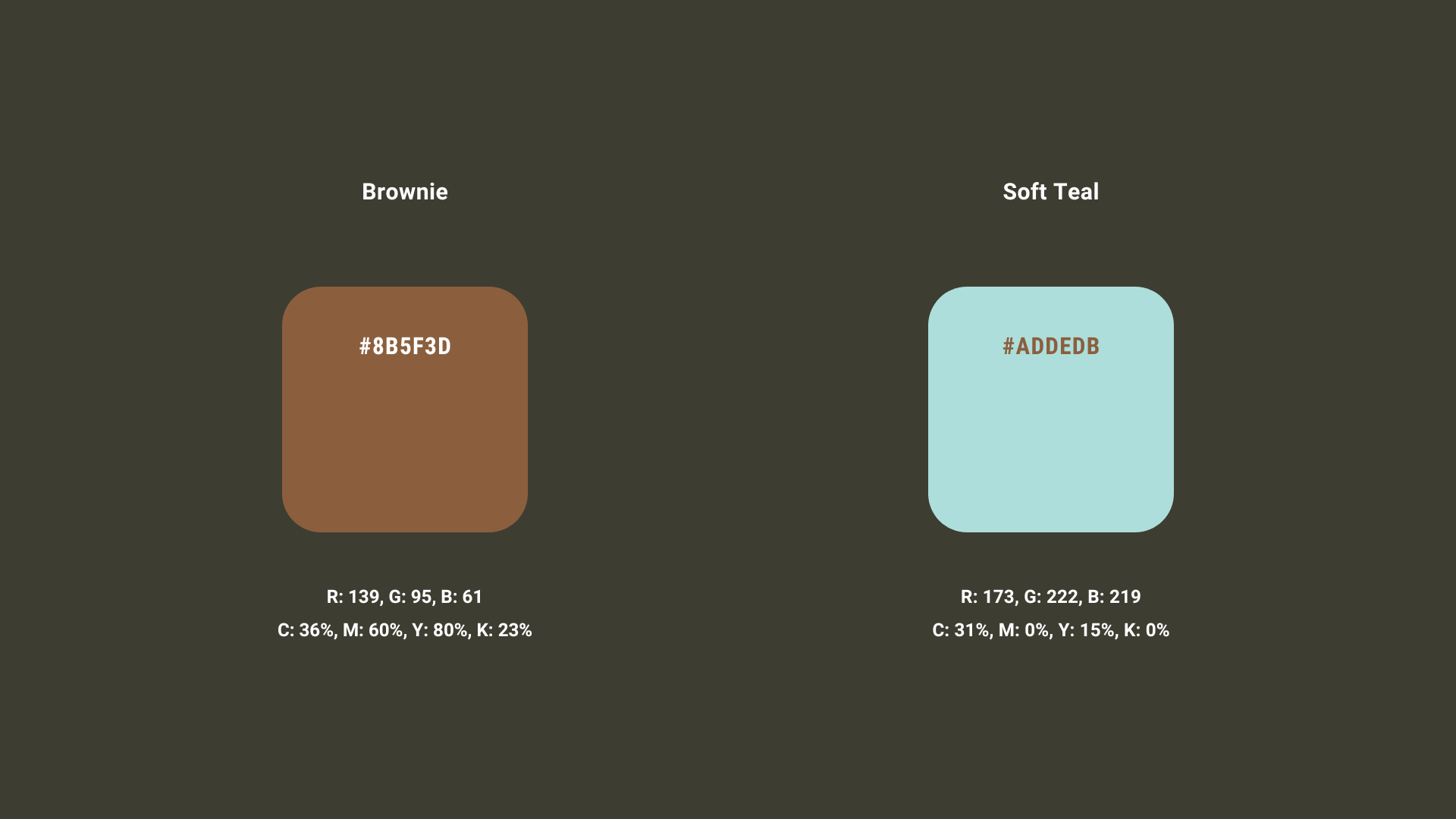
By placing "Scoop-Up Ice Cream" at the top and bottom of the badge, I aimed to reinforce brand recognition. In the middle, I drew an ice cream cone to show that the ice cream is handmade. I added a large circle and centered the ice cream cone inside it. For colors, I chose a light blue like a summer sky and a deep brown to show richness.
COLOURS
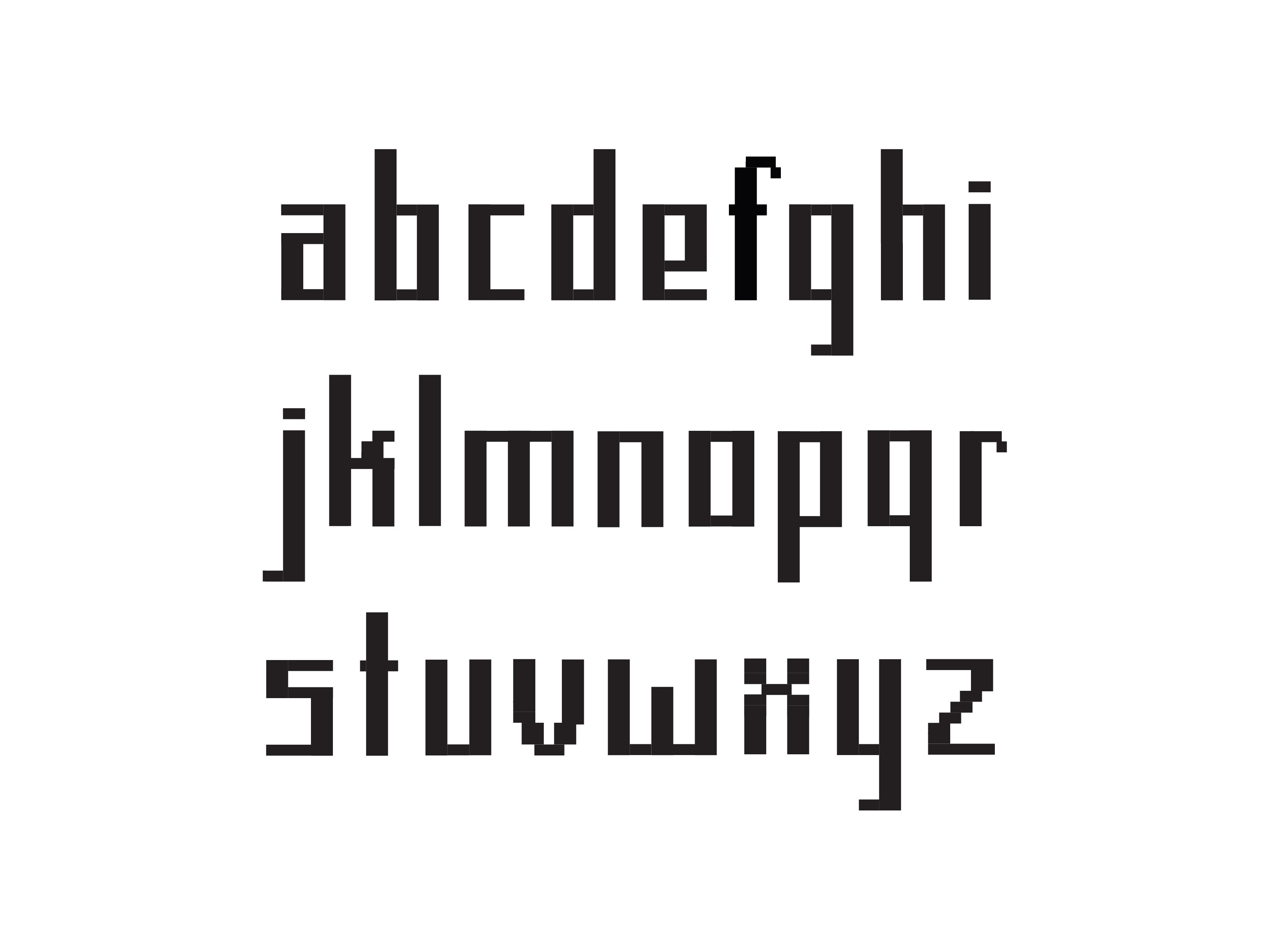
TYPOGRAPHY